What is responsive mobile friendly website design?
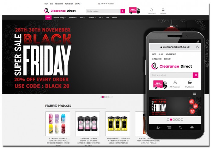
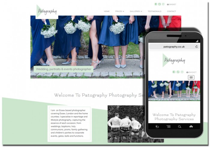
A responsive website is one which automatically responds to the device, screen size and resolution of the device the website is being viewed on.
All our websites are created with a responsive, mobile friendly theme which meets google Mobile and Speed test criteria.
In many cases a standard desktop PC designed website is difficult to view on a smart phone as it will often require the user to zoom in and out and scroll left and right.
There are a multitude of screen sizes used to surf the internet and view websites and these will always change as new and updated devices come to the market. It is important that a website can adapt to these different sizes.
A responsive website allows the menu to collapse as the screen size reduces. Likewise the content on a page would be created in modules so these respond to changes in size by displaying in columns rather than wider rows.
As an example, the content on a page viewed on a mobile device may display in a single column with the user scrolling down to view the whole page. On a tablet, the same information may be displayed in two columns whereas on a PC with a wider screen a more traditional layout would be seen.
Each website will display differently depending on the device whether it be PC, mobile or tablet. However, each will also retain a similar look and feel.
*All our websites are created with a responsive, mobile friendly structure.
For more on our websites design services please visit our Starter Websites or Website Design pages. Alternatively please contact us so we may provide a quote.